Color is such a hugely important part of filmmaking, adding layers of meaning to each scene. When you watch a film, do you pay attention to the colors the characters are wearing? The sets or visuals effects? Each of these can add to the experience in both perceptive and subconscious ways.
In the world of color, there are three important factors: hue, saturation, and brightness. Hue refers to the color itself—blue, red, green, etc. Saturation is the intensity of the color, and brightness is how light or dark it appears. Considering the number of colors in existence, this leads to virtually unlimited options. It can set the mood or even harken back to another character: so-and-so always wears blue, now there are blue items in the background, for example. Check out StudioBinder for some further reading on color theory in film.
For a long time, horror has had the misconception that it’s all washed-out blues and sepia overtones. This is merely one style of horror and was somewhat of a phase in the mid-2000s. Throughout the decades, styles and visual cues change. Just like every other genre, horror spans the entire spectrum of colors in beautiful (and sometimes disgusting) ways. Today I wanted to go through some great examples from every shade of the rainbow.
Red—Suspiria
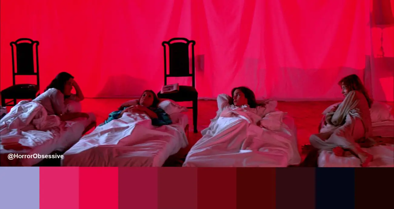
To be honest, I could have probably made this entire list from Suspiria. it’s a gorgeous film that uses everything it can. The classic super vibrant Giallo reds for blood, warm orange-yellows from streetlights reflecting on faces, blues and pinks as background lights…it’s got the whole rainbow. Suzy is our guide to this fantastical dance academy that is completely ridiculous as far as buildings go but a treat for us as the audience.
After the dance students have to relocate to one of the studios to sleep, several girls discuss the headmistress who is supposed to be out of town. They tell Suzy that she has a noticeable wheeze—just like the woman silhouetted behind the curtain. The almost candy red illuminating the room signals there is a danger present (it is famously about a coven of witches, after all!), but it’s soft, possibly showing how comfortable the girls are in this moment.
Orange—Beyond the Black Rainbow

The debut of Panos Cosmatos, who went on to make the equally stunning Mandy, Beyond the Black Rainbow is a retro-inspired dreamlike sci-fi horror involving an institute that tests psychic abilities and how to transcend human consciousness. The institute’s building is mainly white with splashes of a tangerine orange on the floors and in the lights, adding to the ’70s aesthetic. The mysterious Sentionauts (pictured above) also sport an orange jumpsuit that gives off some 2001: A Space Odyssey vibes.
Orange (and I admit, I did not know this before researching) is a color often used to represent happiness, family, and general warmth. Beyond the Black Rainbow uses orange heavily as if to give the main character Elena the idea of the institute as her family even as it drugs and hypnotizes her daily. It’s artificial and uncomfortable from an outside perspective. She exists in a haze that dissipates as she escapes the building and sees the true colors of the world.
Yellow—Honeydew
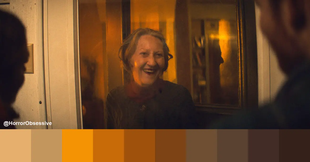
The most recent release on this list, I was immediately struck by how color plays a role in Honeydew. The title is a great descriptor: everything has a rich, dark yellow hue that is both comforting and unsettling. The majority of the plot taking place at a seemingly kind old woman’s house definitely adds to this dichotomy. The honey shade seeps into every part of the film from the clothes they wear to the food they eat. It’s like the film itself is slowly being dipped in goo.
Yellow is often used as a soft, neutral color in general life, from greeting cards to baby nurseries. In Honeydew, it’s an important part of the plot, giving you clues as to what caused the madness the couple encounters. It’s a testament to the film’s crew that they made a “happy” color so sinister.
Green—The Saw Franchise
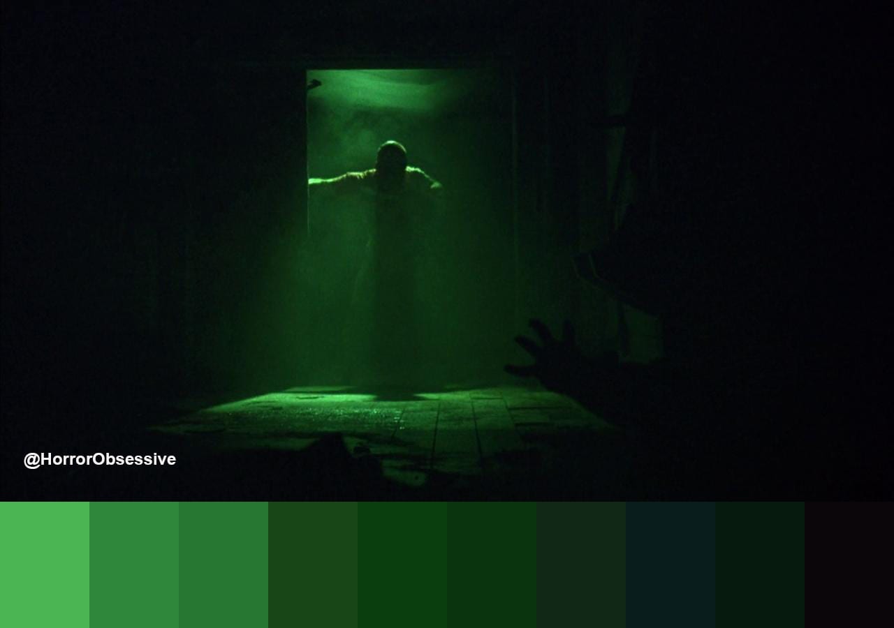
It’s great that such a long-running franchise like Saw kept with a mostly consistent color scheme, using harsh and grimy greens. So much of the films take place in abandoned buildings and use old cobbled-together materials for the traps that the green rust must be just everywhere. I feel like I need a tetanus shot watching some of these scenes. Do you ever watch a film that just makes you want to have a shower afterward? That’s the Saw films for me.
While green is obviously a rich and calming color in plants, for humans it’s never a good thing. Disease, sickness, and infections—all the gross stuff. Most of the other colors in Saw are muted, but the green is a trademark that tells us: sh*t’s about to go down! The TVs that Jigsaw shows up on usually have a super green tint to them, as well.
Blue—The Neon Demon
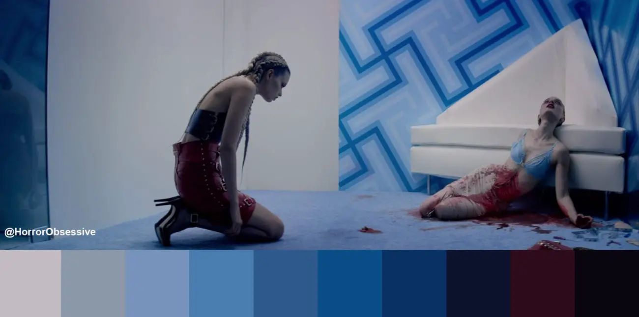
Considering The Neon Demon is a movie about fashion models, it makes perfect sense for it to be as stylish and sleek as possible. Like Suspiria, it uses many colors to tell an eerie story, but the ones that stand out the most to me are the blues. Sky blue pastels, deep oceanic shades, and of course, neons.
Visually, blues seem to have two general meanings: calmness or death. Crime dramas often have a blue overtone to them, giving everything a washed-out and sad look. It’s also one of the most popular colors with many describing it as their favorite. Many companies use it in their logos or branding as it’s seen as non-threatening, but it’s also one of the least appealing in terms of food—because it usually means poison (no shade on blueberries).
Pink—From Beyond
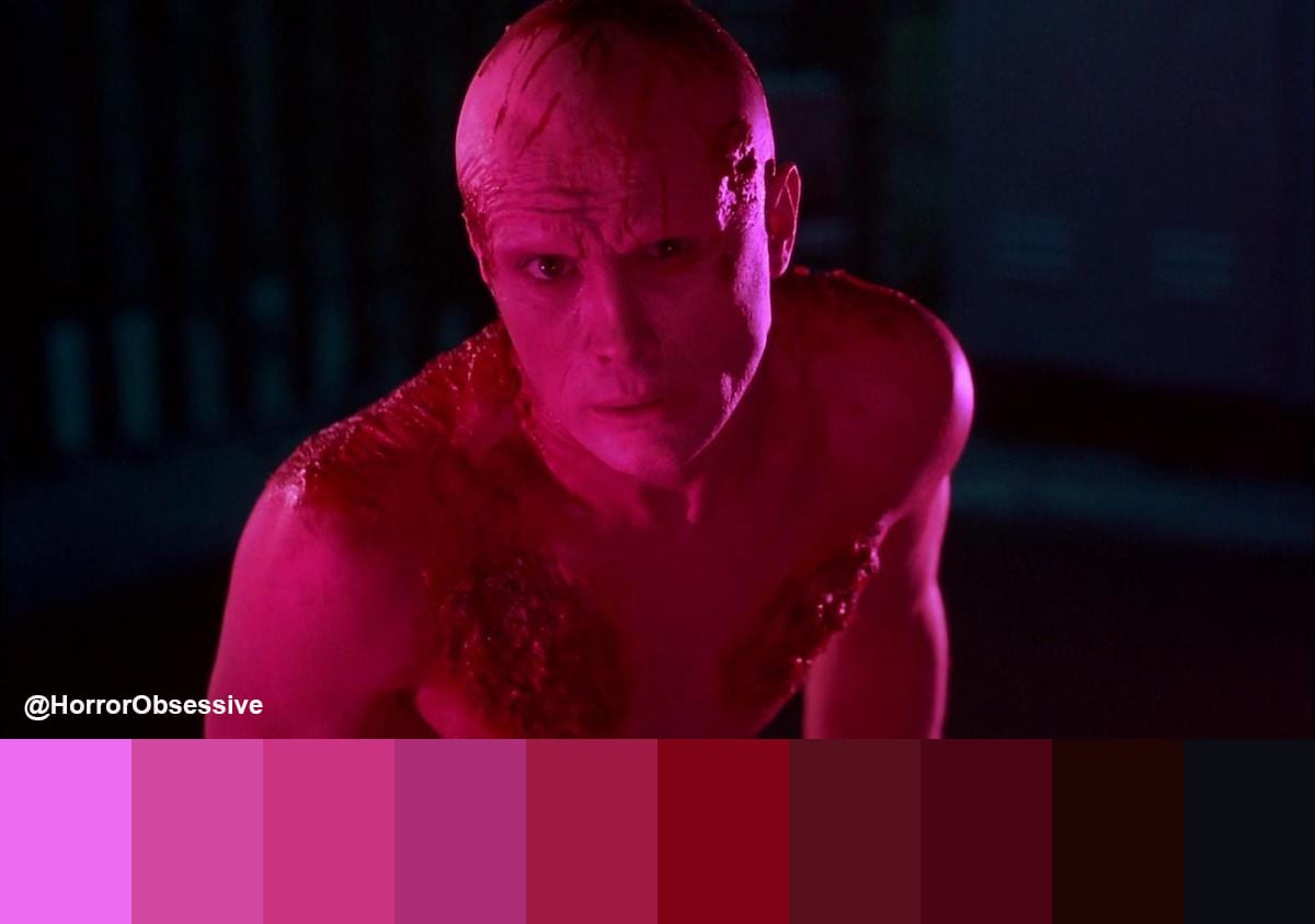
I fully stand behind ranking From Beyond above The Re-Animator for Stuart Gordon films. I love both—there’s just something about this one that speaks to me more. Pink is my favorite color, so maybe that’s it. In it, the characters use a machine known as the Resonator that washes everything in pink tones and lets you see monstrous creatures.
Pink isn’t usually a color seen in horror, besides as the natural shade for organs and other fleshy bits. You know exactly when the “other world” is messing with our reality when stuff gets the bubblegum highlights in From Beyond, and it puts you on edge.
Pink is sometimes not even considered a real color—although it’s used by practically every form of media to show stereotypical feminity and “womanhood” (that’s a whole topic for another time, though). From Beyond is quite a male-centric film, with phallic symbols aplenty. Perhaps it’s a subversion of the idea of pink.
Purple—Color Out Of Space
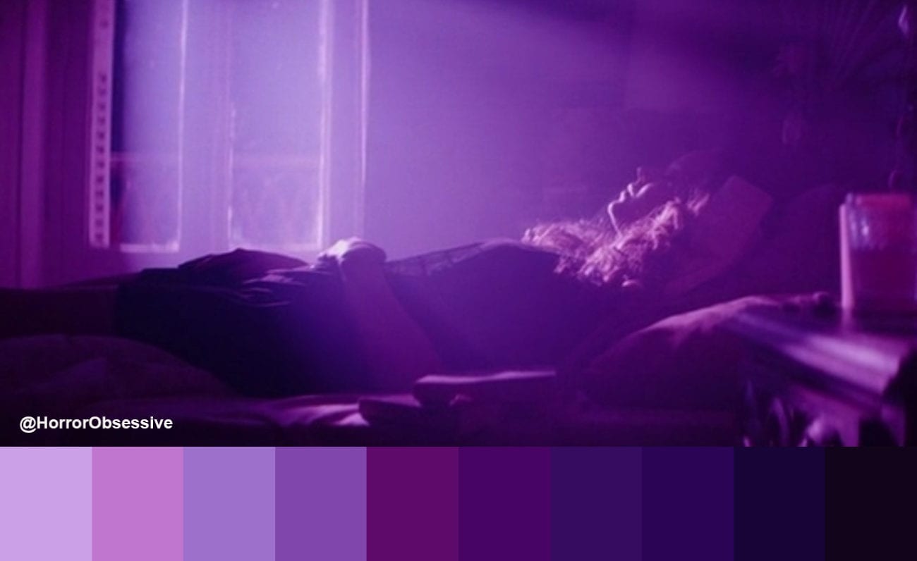
To have something so alien and beyond our understanding also be represented by a beautiful and mysterious purple is something I can get behind. It’s not a common color in nature, and historically it was used by royals and elites to show status. In the original Lovecraft story (as with many of his stories), the color is indescribable and outside of the visible spectrum. It wasn’t until the story became adapted into films that a color was chosen. First, it was green in Die, Monster, Die! starring Boris Karloff, and later it became the purple we see today.
Purple is a color used to show the mystical aspect of things and is often found in fantasy, especially in video games. Casting spells with a purple glow is pretty much the norm. Besides flowers, it’s most often seen in fish and sea creatures—a totally different world from our own.
I would be remiss if I didn’t mention the news about Richard Stanley’s abuse. It’s unforgivable, and I do not condone his actions in any way. However, it takes a village to make a film, and I want to acknowledge and appreciate all the efforts that went into Color Out of Space, from the writing to the special and practical effects and the acting. Stanley only had a part in this, and it’s thanks to the talents of everyone that it was made.
While there is no set rule for how color is used in films, the associations behind each can help push the audience into the mood a filmmaker is going for, whether we realize it or not. You can see how some use it in the opposite way—to create the unexpected, to subvert, to add discomfort. Horror is perfect for this. To make us feel fear or disgust by adding certain shades to a film is just another important tool in the toolbox of horror filmmaking.
So the next time you watch a film, take a look at the colors in a scene and ask yourself: what is the film trying to tell me by having this green here, or this blue there? If anything else, it’s a fun activity to get discussions going.
Horror films that use color as such a huge part of the experience make up some of my favorite films and the ones I find myself going back to again and again. Everyone has a favorite color, but do you have a favorite film that uses it heavily? I’d love to know!